Build me up, buttercup

After seeing a handful of portfolios built solely on Photoshop, I was inspired and decided I'd practice building up an image from nothing, building up it's colors, and tonality myself. It's been awhile since I've build up anything like that so it was a long and tedious process but I got it done, or at least tried. I've learned to love Illustrator, and now I actually prefer it better than Photoshop so the fact that I don't have it leaves me feeling paralyzed sometimes. But after finding some incredibly beautiful and intricate photoshop work I was encouraged to keep practicing and perfecting my use of photoshop. I love using photoshop to enhance or tweak photos (after all that's what its for) but with enough practice and patience you can render just about anything.. just without the ever so lovely and helpful vectors on Illustrator. Here's what I have so far.

This is my original drawing done in graphite on newsprint.
(Stupid idea by the way, newsprint doesn't last to long and isn't the best for delicate work, I should have used bristol board. Lesson learned) It's a fairly old piece that I did it either early this year like in February sometime. I also wanted to develope the rest of the image and get rid of the negative space shes drowning in. I will do that soon enough. For now we're moving on...

Here's what I had halfway through the process. I was still building up the shadows and layers of the dress and the hair was a mess at this point. Also the skin tone wasn't to appealing so I definitly had along way to go.

Tada!!! We can call her Buttercup for now. But I'm definitely not finished with her. If you examine her real good she's got to many flaws and imperfections that bug me so I'll go in one day and clean her up. Then that's when I can start developing a background and stuff too. I have a tendency to leave pieces halfway developed so usually the negative space will come back and haunt me.

Despite all the flaws that bug me, I'm pretty happy with what I have. I wasn't sure I could even develop this image from scratch, especially working from graphite into color (note digital color*) can be pretty tedious. And from someone who's pretty particular about color use (I'm not to much of a color fan, Give me anything monochromatic and I'll be more than happy) I'm pretty satisfied. Alright well I think I'm done practicing for now, back to working on secret projects and stuff.
Show and Tell {02}


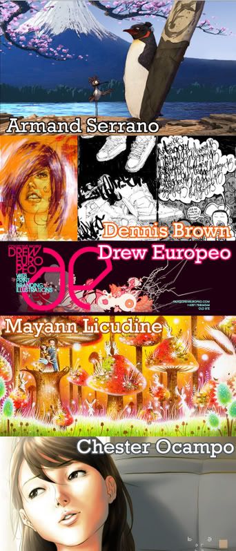
I set out on a mission to find more Filipino designers, illustrators and artist like I said I would and found these five. Each has their very own style, industry and creativity. I managed to cover just about everything from traditional art, to graf, to animation with these five amazing artist.

Armand Serrano is an Animation artist and has done work on movies like Surfs up, Mulan, Lilo and Stitch and Brother Bear. Dennis Brown is half Filipino artist based in San Francisco. Drew Eur0peo designed the last MTV Filippinas Music Award visuals. Mayann Licudine is a Philippines based artist who does absolute magic with acrylic and colored pencils. Chester Ocampo is a wonderful illustrator and comic artist.


On a very different note every time I pick up the latest Urban Outfitters catalog I not only fall in love with their products but I usually go "goo-goo" for the actual layout and design of the catalog itself. I've always wanted to know who's work it was because if they produce print so beautifully designed as this, I can only wonder how brilliant their other work is. National Forest is to blame for such brilliance.

Grounded

So I've noticed something about myself,
I can never seem to keep my feet on the ground.


{Don't say it. I know what you're thinking: "What a dork!" }

But despite what the pictures portray and despite being a complete dork, I think I can say I'm pretty well grounded. Enjoy the laughs.

Distant October

The month of October is about to end and has gone by pretty quitely and fairly quickly. This got me and my sisters thinking, and reminiscing about both good and bad memories of past, and very distant Octobers.

Take last year for instance, the month of October was probably my most traveled month where I went on a 17 hour road trip through Kentucky and Tennessee with my family and Rio, and then me and my three sisters went to our first Marine Corp Ball at Camp Lejeune, NC. It's been a year since, and I believe we've never really shared the fact that we went, let alone any of our pictures from the Ball. We had good reason for doing so, but enough time has gone by to finally share them with the world.

Alot has changed since then ... granted it's been a year, and one thing I noticed is that even the quality of both my camera and photography have changed. Enjoy them anyways.


Posted by Picasa

Show and tell {01}

Its been awhile since I've shared or blogged strictly about graphic design. I've been loving alot of new portfolios and artist lately so it's about time I share them. I've been blogging about a few photographers and I've shown a few of my own free time doodles on photoshop... so I'm calling in a show and tell time.

Show and tell: I'll show you what I'm loving from the graphic design industry right now, and then I'll tell you why I'm loving it. Since I'm currently at a standstill in my design education I like to engulf myself in what's actually out there and keep myself up to date. Hope you like these few designers as much as I do.


Karan Singh is a 20 year old from Sydney AU who's designs are retro with a skater boy twist. His use of color inspires me and lead me on a search for even more colorful work.

Check out NoPattern.com to see the brilliant and colorful work of Chuck Anderson. His work contains an originality like none other. His most recognizable work right now is probably Fall Out Boy's latest album cover , Identify on High.

I met the darling designs of Jill Bliss a long long time ago without even knowing it. Last semester when I had a big 3 hour break between my typography and 2d-3d classes I would retreat over to Borders and get lost in my own little world of pages and letters. One of those days I got lost in the journal section of the store (I collect them by the way, and yes I write in them, that would explain the blogging tendencies) and saw these darling journals designed by Jill Bliss. I was instantly drawn to not only the lovely covers, but also the beautifully designed pages that were inside the journals. Empty pages never looked so beautiful. But sad to say I didn't get a Jill Bliss designed journal that day because by the time I stumbled over them I had already purchased a different journal. "You can't have it all" .... i like to say. Then just the other day I stumbled upon her portfolio online, what a delight.

On the contrary to their name, I love theyhatemydesigns.net. Their designs are fun to look at and this group of logos they've created reassures me that logos can still hold alot of personality, detail and originality but still be fairly simple and versatile.

Lastly Studio Radia. Sorry I'm unable to post a picture of some of their work right now ... I'll get one up as soon as I can. But in the mean time, let me tell you about Studio Radia. Simplicity is key with this studio but is very powerful and effective. I came upon their work when a professor of mine suggested great design museums to go to and mention the Cooper Hewitt National Design Museum in New York (By the way I heart art museums. I could go to one everyday and probably never get bored.) Since I've been itching to go to the Cooper Hewitt Museum I've done my research and looked into some of their merchandise and liked their designs which lead me to Studio Radia who's also done branding development for Napster and Virgin Air.

Next show and tell: I'll share a few answers to my "(I LOVE THIS!) Who designed it?" question. Like who designs the Urban Outfitter's catalogue, and who designs some of the latest and hip christian magazines, or who are some more Filipino graphic designers out there. Also, because my favorite graphic designs usually go hand in hand with photography I'll also share some photographers I can't keep my eyes off of. Till then please feel free to show me what you love (pertaining to graphic design or art of any form). My sister is really good at that and usually introduces me to stuff she knows I'll like even if we have pretty different styles and taste but sharing art and designs is great fun.

You look like Fall


I made a really random, and grammatically incorrect, fob-ish comment yesterday and said to my sister "Sister, You look like fall." It made no sense when I let the words spill out of my mouth but in my head it made complete sense. Here's me trying to make sense of what I was trying to say.

Collection of the week {04}


The collection I chose this week is Sean Armenta's photography. I guess I should say kuya Sean, because he's the husband of one of our good family friends in California, though I've yet to have had the pleasure of actually meeting him. He's a fashion photographer and has worked with Paul Frank, and Paul Mitchell. He's had publications in a number of magazines such as Cut and Dry, Trendsetter Magazine, and InStyle.

A few months ago I went to Paul Mitchell the school in Tysons, where one of my "sisters" studies and I was flipping through Cut and Dry Magazine and fell upon a spread taken by kuya Sean, and following it was a spread about kuya Sean himself. It was that first picture of his studio that gave it all away. I've been on kuya Sean's site many times and under his studio information is a picture of his space. There was a very similar photo published in the magazine and knew it was kuya Sean's space. Later on I went through my "sister's" color book and I instantly knew most, if not all, of the photography work was kuya Sean's work because I saw some of the photos on his site already.

I myself, don't have to much of an eye for fashion photography, I think I take on more of a journalistic approach to my photos, but I appreciate fashion photography just the same. A beautiful photograph is ... a beautiful photography, whether it's fashion, journalistic, or anything in between.

Lovely Noodles

This weekend filled with good food and tons of eventful happenings. Out of all the things I did this weekend Saturday was my favorite.

It some how turned into a "sister day" because the moment we woke up both me and my sister had the urge to go to Borders and read the morning away. Over omelets and coffee we talked and read for hours. In my opinion it was probably one of the most relaxing mornings I've had in a long while. After that our mom picked us up to go to Maryland for her eye appointment. As she went in to get glasses me and my sister went out on an adventure. Hoping to find a nice little thrift store around the corner, we ended up finding a random Entenmann's outlet and used furniture store (nothing that tickeled our fancy).

All the adventuring got us both really hungy so later on my mom dropped us off at Noodles & Company for an early dinner as she went off to go do her own thing for a little while. It was the first time me or my sister ate at Noodles & Co. so we didn't really know what to expect. I've seen a Noodles & Co. near my best friend's work but that's as close as I've gotten. Not only was the ambiance inside the resturant quite lovely (Me and my sister came to the conclusion that Noodles & Co. is in between a fast food resturant and an acutal sit down meal resturant.) but their menus, cups and chopsticks were lovely as well... the food wasn't bad either, though my sister's food was more yummy than mine (she's always been better at ordering food).

Now I'm on a mission to find out what design firm put together their logo and packaging because I love their fun designs and use of color. Here's a quick look at their stuff... and definitly check out their website, it's absolutely darling. I love accidentally stumbling over lovely designs.


Posted by Picasa

Play

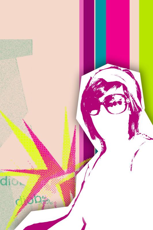
I was bored and wanted to play.

I haven't had or used photoshop for awhile, but now I'm back in business.

I made this piece not knowing exactly where I was trying to go with it, as it usually happens. But I can give you a rough draft on what I was thinking when I was making it.

I chose this photo, one of me in my friend's big old glasses while we were out shopping in Georgetown, because I love big sunglasses and I remembered how much fun I had that day so I wanted play up both (the sunglasses and the fun). Hope you like it.

Gummy Bears and Roses

Today started out quite normal: wake up early, take care of the girls and watch some Dora.

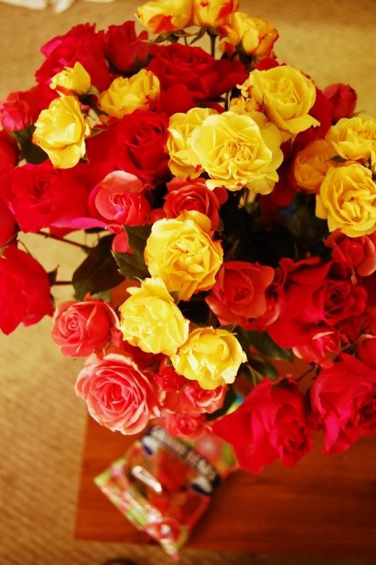
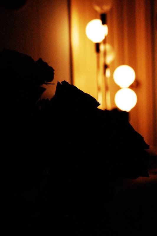
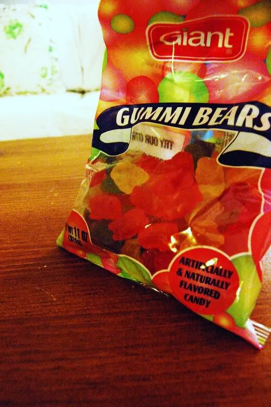
But some time during the middle of the day I was completely caught off guard with a bunch of roses, a bag of gummy bears, and a boy standing outside my front door. Everything wasn't for me though, a batch of the roses were for my sister and a batch for my mom...but the rest, was mine.

Tim came over surprising me and bringing gifts, making my day pretty special...when it could have easily been a very ordinary Thursday.

Thanks for being so sweet Tim.


You smell like rice.

Collection of the week {03}

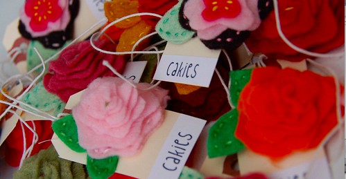
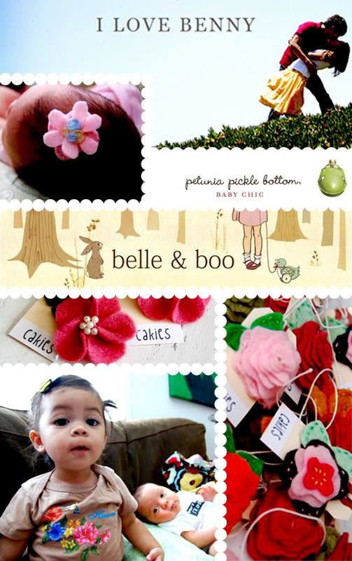
The collection of the week is one that has become quite near and dear to my heart. It's Cakies!

A friend of mine in California, Ruby Ellen , (might I add a beautiful mother of two) makes these amazingly beautiful hair clips for kids and sells them at different baby boutiques in LA. Recently I've been working on a project with Ruby and let me just tell you her ideas, and craftiness is so cutiesy and simplistic. I love her stuff. Someday I'll share with the world what project I've been working on with her but for now it shall be our own little secret. Hehe.
But what I will share is my interpretation of Ruby's cakies inspirations. So I put together a little inspiration board. These are a few things that Ruby shared with me that inspire both her, and her creations.
Photo Sharing and Video Hosting at Photobucket
Working with you Ruby has been a blast and like I said, I absolutely love your ideas, style and the personality you put into your cakies. Your collection of cakies is soo lovely and if I were a little girl again I'd be one hungry girl for your cakies.

Mission trip Summary

The trip started out Friday morning just me, Hope and her Dad Jay ... with a scenic 6 hour drive out to Claypool West Virginia.


After getting settled in at our hotel We met with all four mission groups Samaratan's Feet, Coca Cola, Medical Samaratan's and Playbook for life for dinner. Both Hotel accomodations and food were provided by Coke.

Early Saturday morning we all met up for Breakfast to get instructions and directions to start our day. The we all ventured of to the little town of Bradshaw up in the mountains about 45-50 mins away.

Once we arrived in Bradshaw we were told a bit about the history of the church we were working with and this was their current church building.

At around 8 in the morning it was about 40 degrees outside and fog covered the whole area till the sun peaked out over the mountains later in the morning.

Further on down the road was their new church site. It sits right in between two of little mountain peaks and consists of two large storage houses as their church building.

The moment we got their at about 8 we had our work cut out for us. We had to unload boxes and boxes of shoes and unpack each individual pair so that they'd be ready to be put on.

Before unpacking all the shoes we received our Samaritan's Feet t-shirts and went to work.


While unloading all the shoes a pile of empty shoe boxes started to pile up outside.

Here is my papa for the weekend Jay and the handsome Nigerian is Manny, the man who started this whole ministry.

I love Manny, and as you can see he's quite a tall man but it's perfect because the size of his heart and the size of his passion for serving God and serving others fits his size to a tee.

This is Mike (the first Michael of two from that day) and He was my first partner. He was one of the first feet washers of the day and I ran for him (Got the shoes and socks for him)

Before we even got started the Coca Cola team already started building the stage and pulpit for the church and through out the day you could hear them at work hammering and working the day away. It was quite an experiance seeing Coke help build up a church.

Before any one came in to get their feet washed and get a new pair of shoes and socks they had to be sized first.

Then the washing began.


And shoes were given.


And souls were saved, and lives were changed.


This is the other Mike. My newest brother.

And that day I met Mike, Mike met my friend Jesus.

A the end of the day we had a outdoor service for the church and the people of Bradshaw.

And the Pastor was brought to his knees.


By the end of the day 303 pairs of shoes were given, and before those 303 pairs were recieved about 300 pairs of feet walked in and were washed, prayed for and love. Though there is one number that remains unkonwn, probably the most important one to know, but countless came to know Jesus as their Savior and Lord that day... only God knows.

I am absolutely blessed and grateful for the group of people we went with and I pray that were ever God leads them next that God will do great and mighty things with all of them.


The trip seemed all to short by the time it ended but I know that the work and the seeds that were planted that weekend in the hearts of the people of Bradshaw have only just begun to grow.


Dear Lord,
I pray that you be with that little town of people who are broken, lost and in need of love. I know that only you can take care of their every need whether it be physical or spiritual. So I lift them up to you and I thank you for allowing me to spend a weekend with them "loving on them" and bring them to You.
-Your Servant

{There is soo much more I'd love to share about my trip, so stay tuned for more}